01Smart glasses have no screen to tap
Everything happens through a capture button, taps and slides on the temple, and a wake word, "Hey Buddy". For most buyers this is their first wearable of its kind, and nothing on the glasses tells them what to do.
So onboarding wasn't just setup. It was the only chance to teach the product before the user wore it out of the house. People open this app for one reason: they have just bought the glasses. Whatever else happens, onboarding has to train them.
The brief I set: every user should leave onboarding having performed each core action once, on their own glasses, without feeling like they sat through a manual.
02The problem
Four things stood between a new owner and a confident first day.
- Setup friction. Account, OTP, Bluetooth pairing, permissions and charging all have to work before the user experiences anything.
- Invisible controls. Gestures can't be discovered on your own. Single tap, double tap, long press and slide forward/back each do something different.
- Unfamiliar voice AI. Users didn't know when Buddy was listening, what they could ask, or how to stop it.
- System conflicts. Spotify, Google Assistant and Siri could take over the glasses' inputs mid-tutorial and break the lesson.
03My role & principles
My role went beyond the UI.
- Defined the milestone structure: identity → pairing → gesture → voice → connections, with gesture deliberately placed before voice.
- Owned the information architecture: what to teach, in which order, and what to leave out.
- Led the team on the user flow, screen design and microcopy, with daily reviews.
- Reviewed and contributed to the onboarding technical spec with the PM, glass team and developers: per-step hardware event filtering, edge cases and the QA test suite.
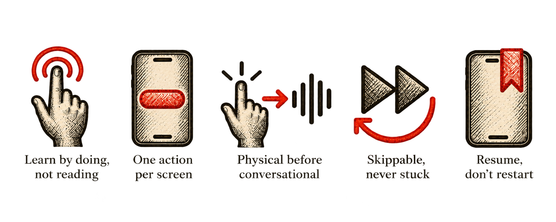
Five principles guided every screen.
04The journey — five milestones
Each milestone has one job.
Milestone 1 · Identity
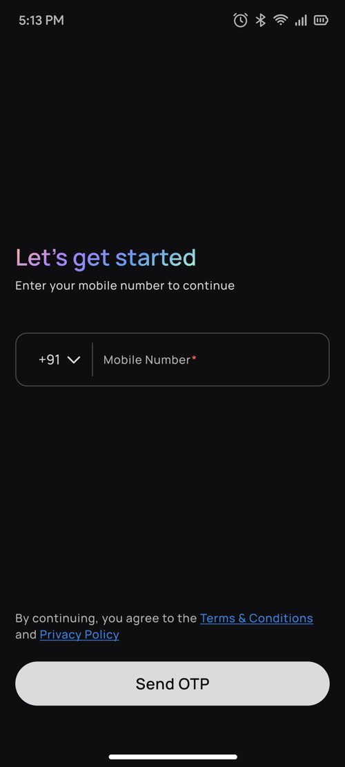
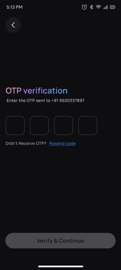
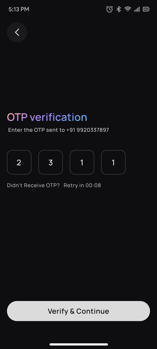
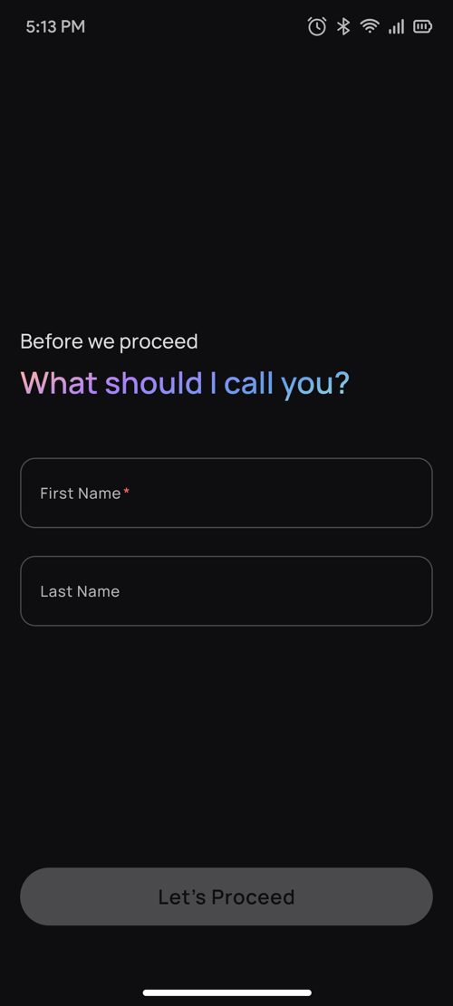
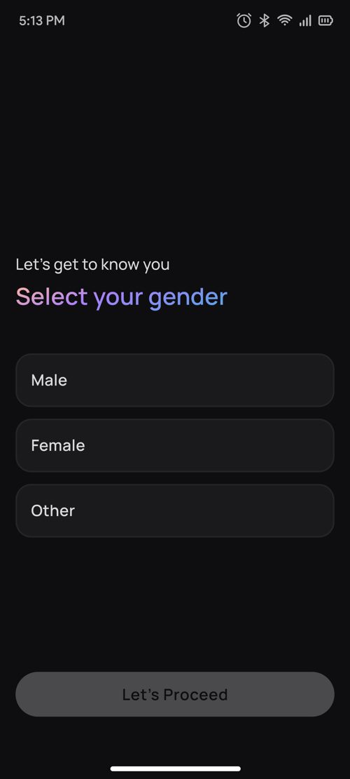
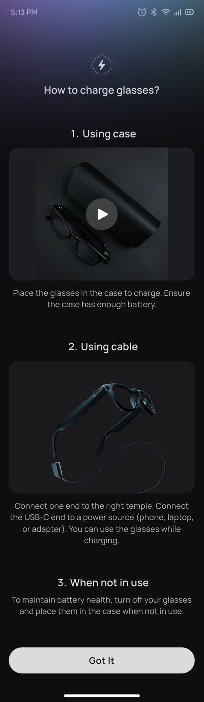
Mobile number → OTP (auto-verifies on the last digit, 60-second resend timer) → name → gender. These aren't just form fields: the name is used in Buddy's spoken greeting, and gender sets Buddy's default voice. A charging guide comes before pairing, because a flat battery is the most common reason pairing fails.
Milestone 2 · Pairing
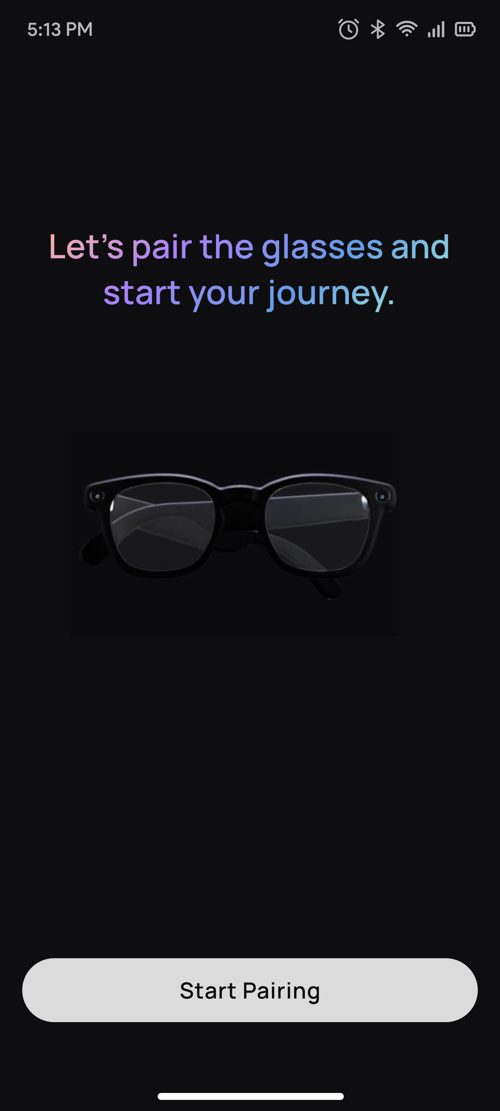
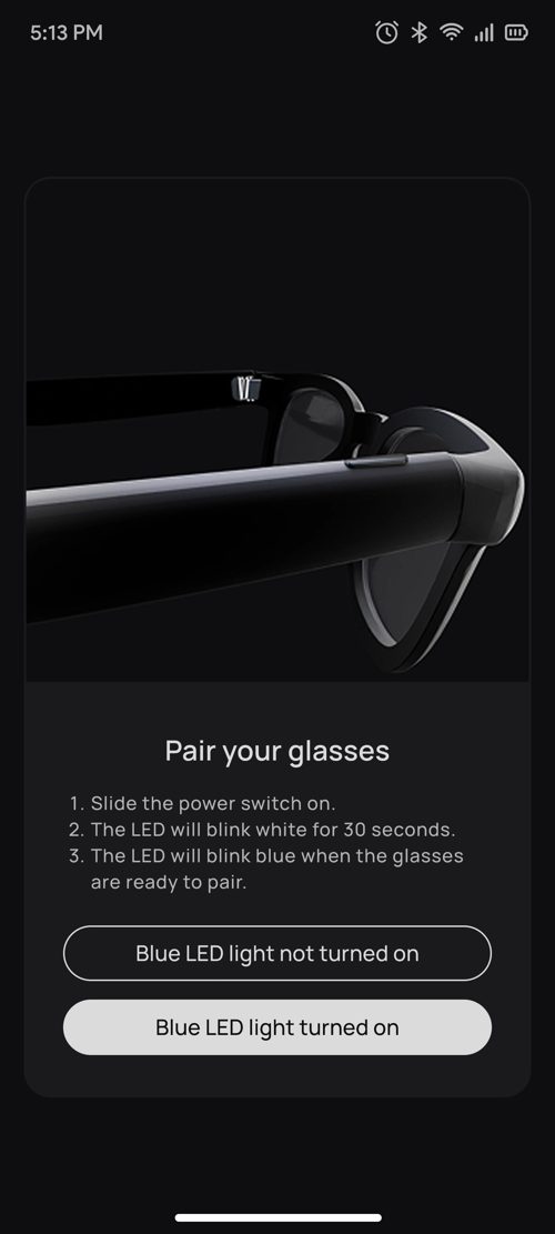
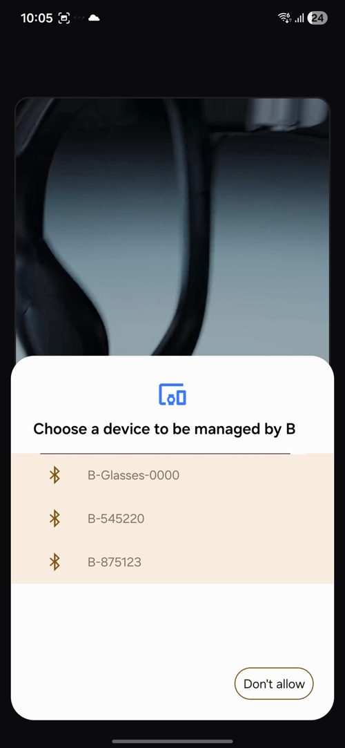
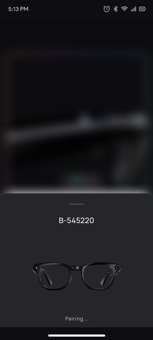
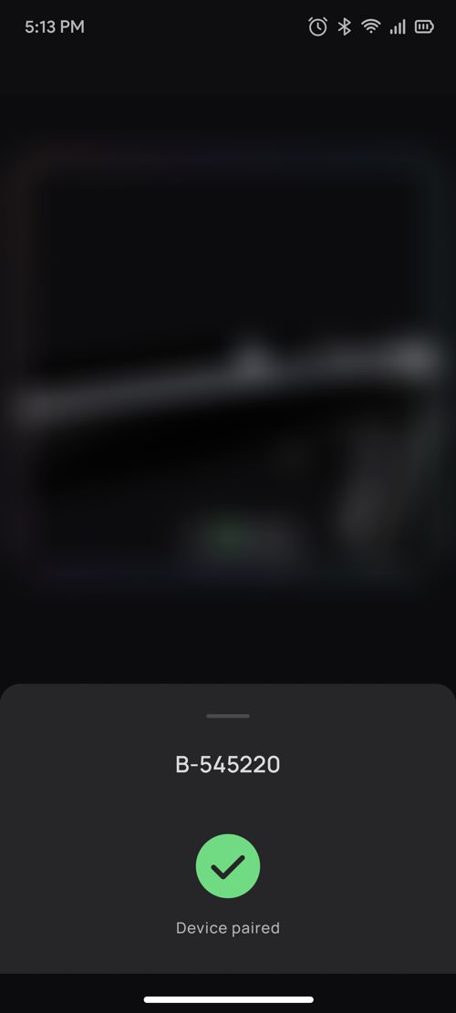
Designed for four real-world situations: new glasses with no permissions yet; glasses already paired through phone Bluetooth while the user wants new ones; glasses already paired with the user logged in; and pairing later from the Device tab after skipping.
- An LED check question ("Is the blue LED on?"). We ask instead of assuming. "No" leads to a reset guide rather than a failed scan.
- Separate iOS and Android flows, following each platform's Bluetooth and companion-device patterns.
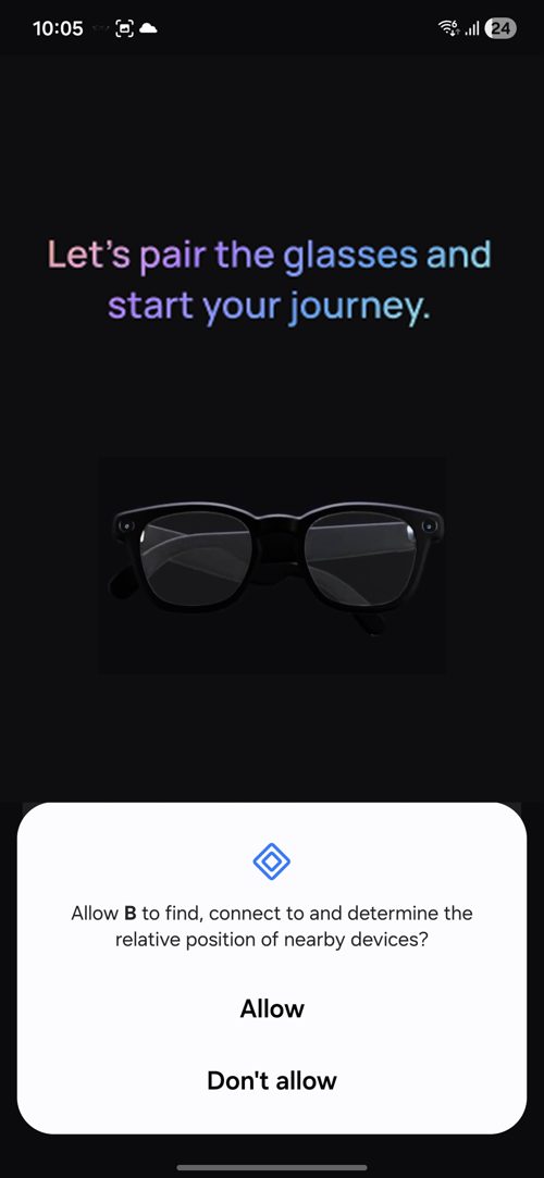
- A denied permission leads to a clear explanation and a link to Settings, never a dead end.
- Notifications, contacts, microphone and nearby-device permissions are requested after a successful pair, when the user can see why they're needed.
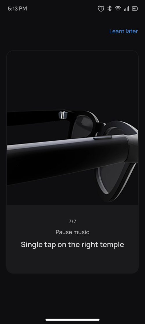
Milestone 3 · Gesture tutorial
A sandbox on real hardware.
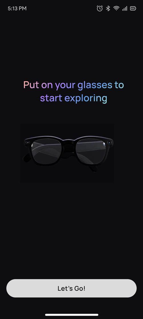
- "Put on your glasses to start exploring." The CTA stays disabled until the glasses detect they're being worn.
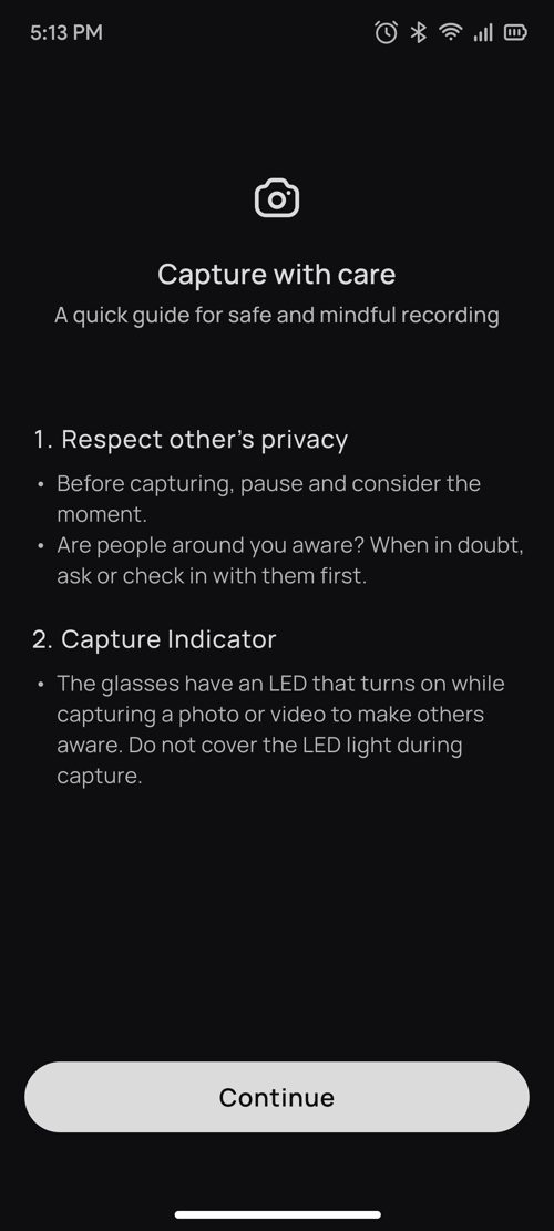
- "Capture with care." The privacy guide appears right before the first photo, the moment it's relevant.
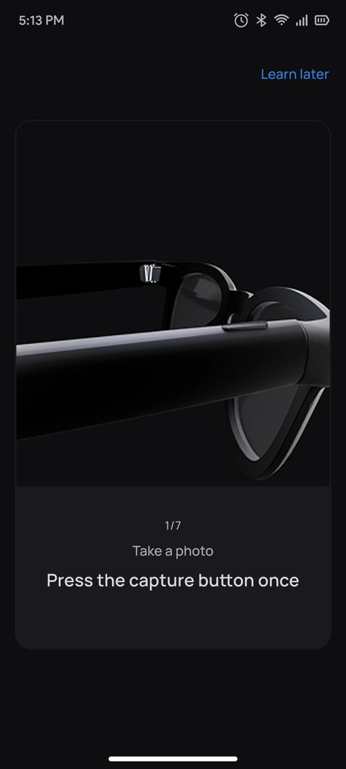
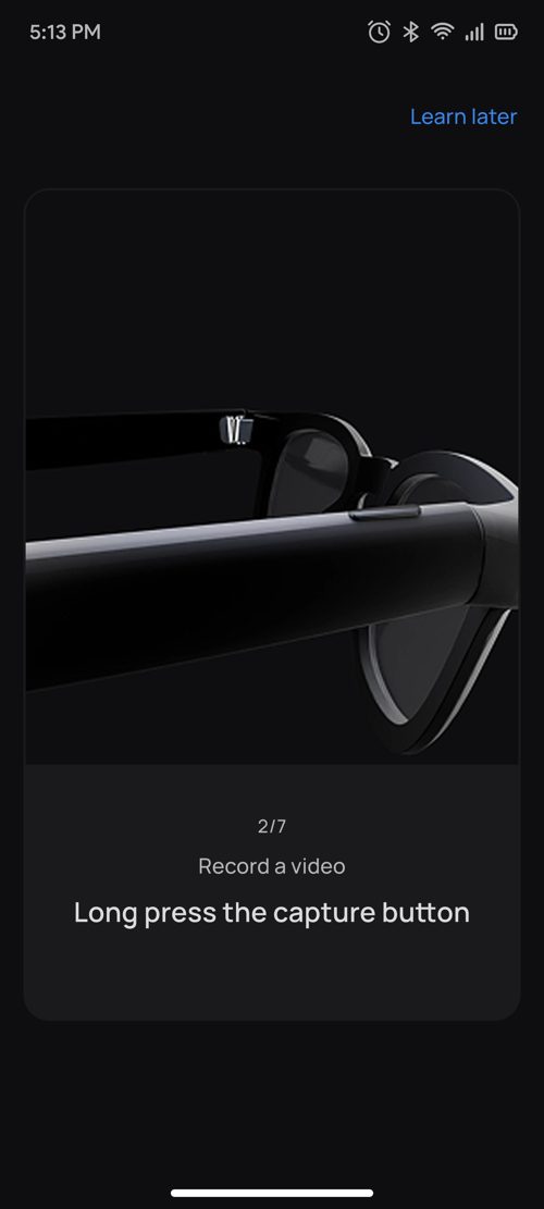
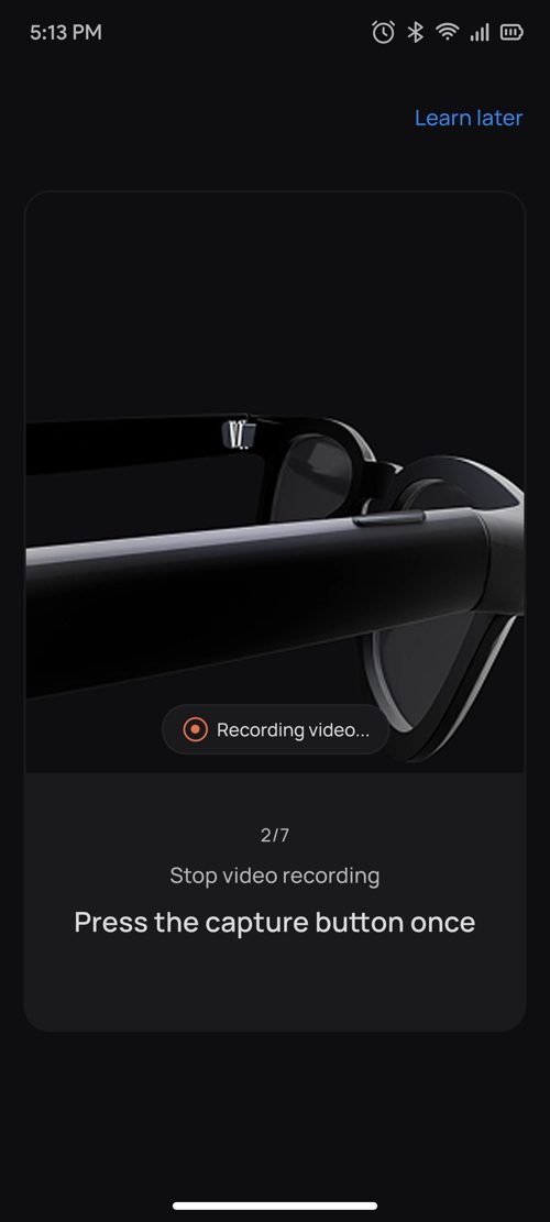
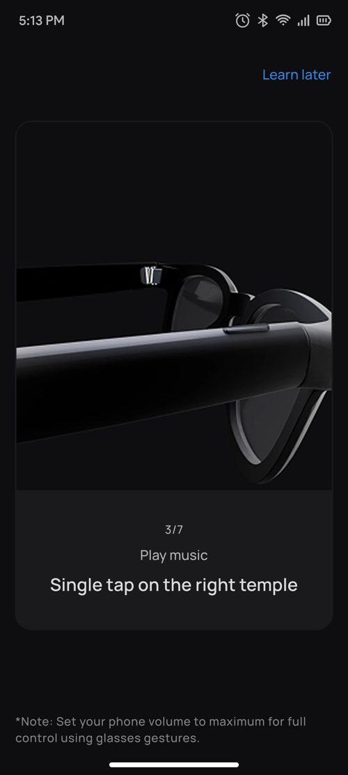
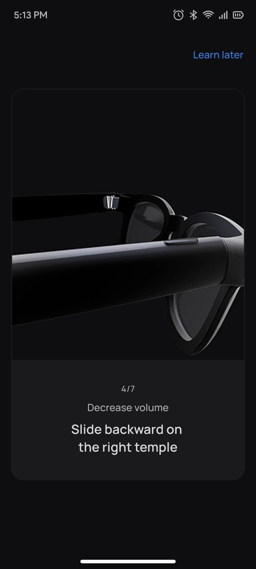
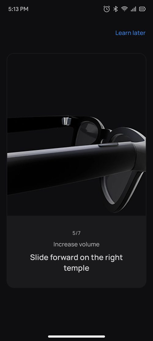
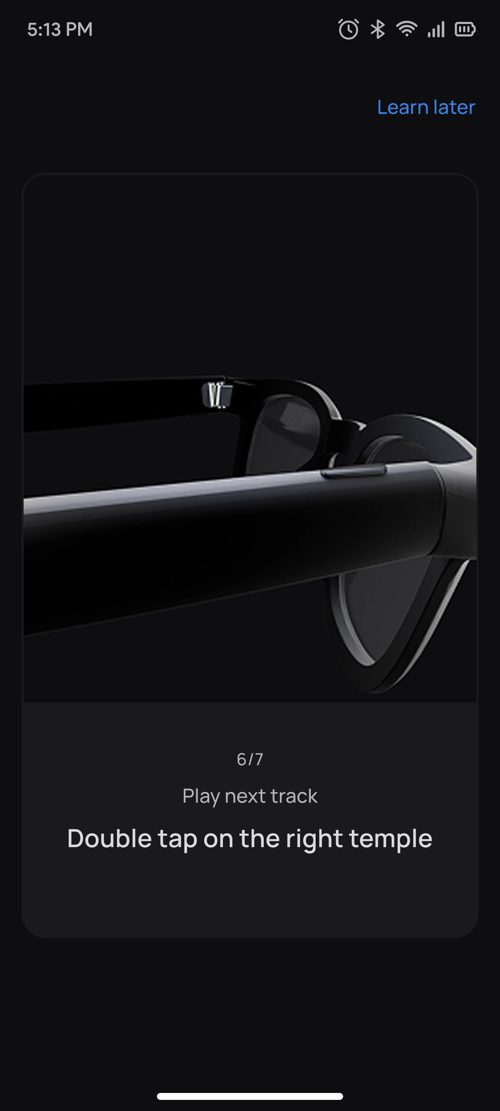
- Eight guided steps: photo → start video → stop video → play music → volume down → volume up → next track → pause.
- Event filtering: each step listens only for its own gesture and ignores the wake word, other gestures and background music, so the user can't accidentally break the lesson.
- A wrong gesture isn't an error. The step simply waits, instruction still showing.

Milestone 4 · Voice tutorial
Building trust with AI.
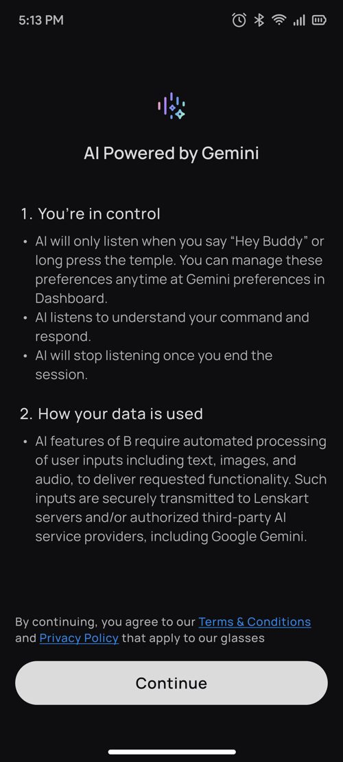
- "AI powered by Gemini" disclosure explains what Buddy does and how data is used before the user ever speaks.
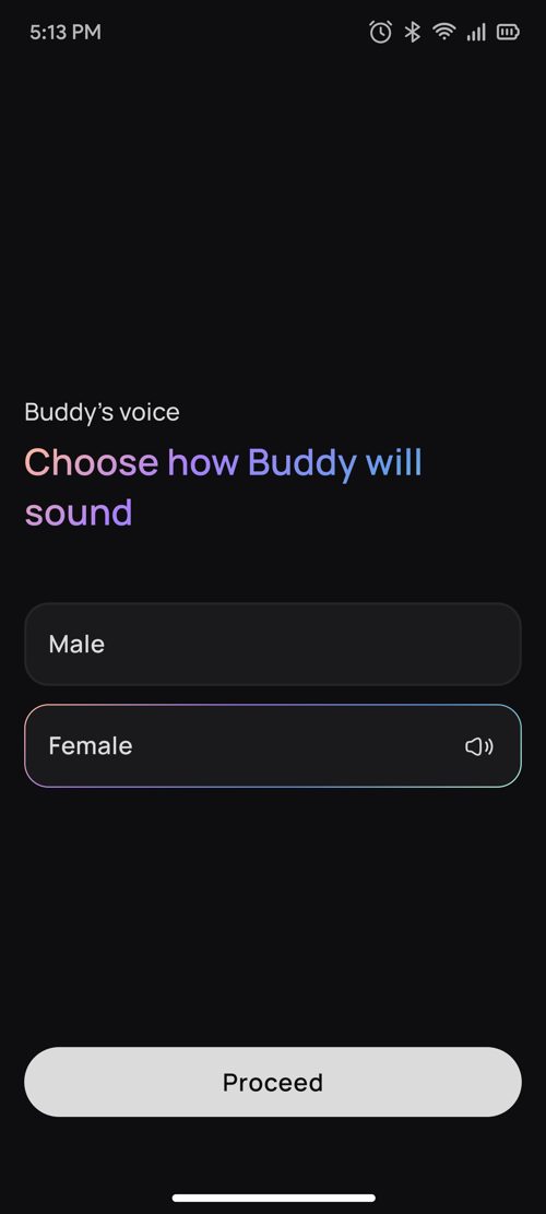
- Choose Buddy's voice (male or female), with a preview.
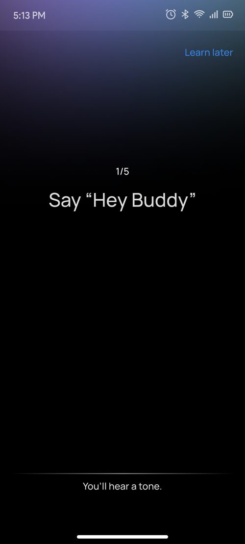
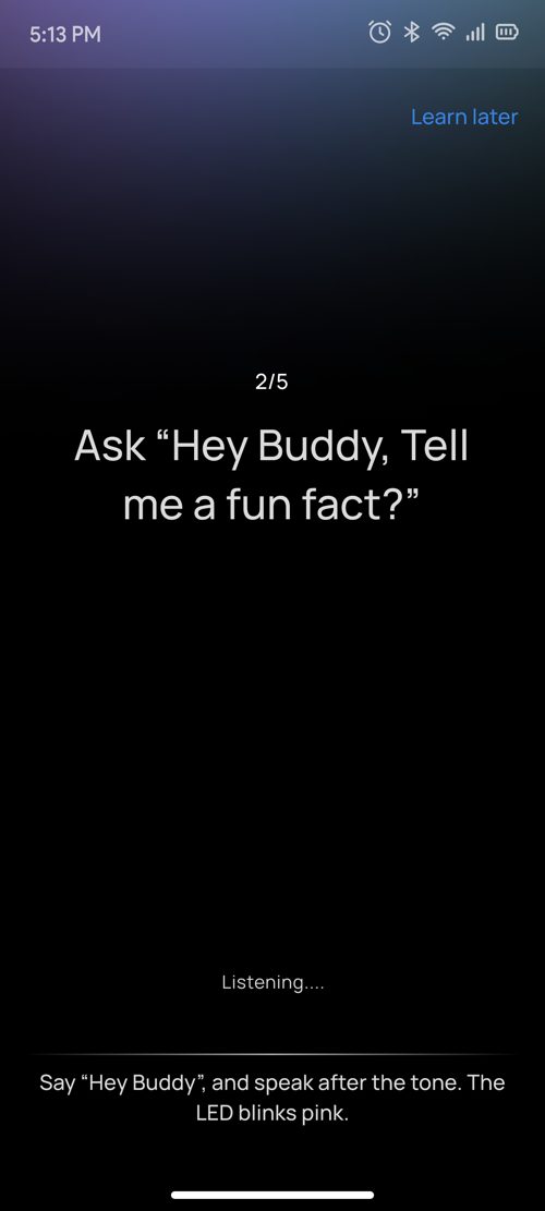
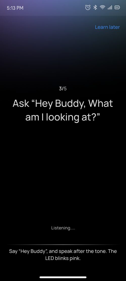
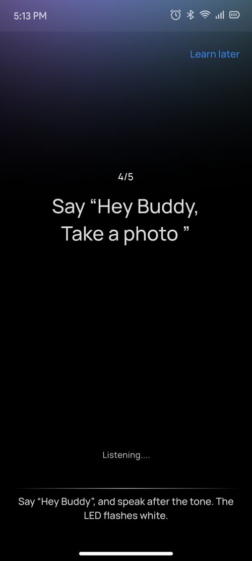
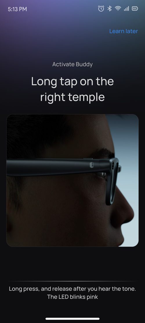
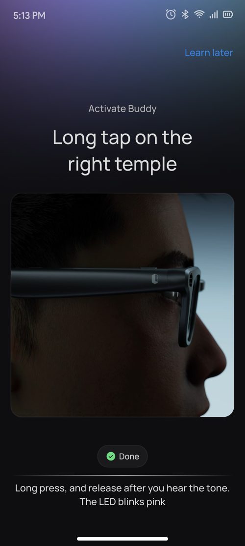
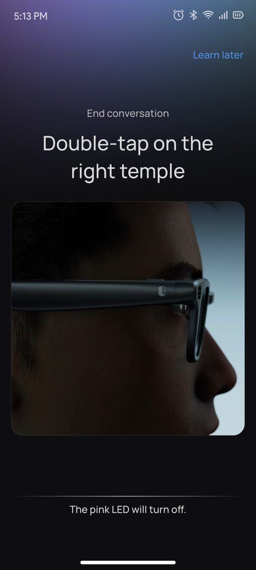
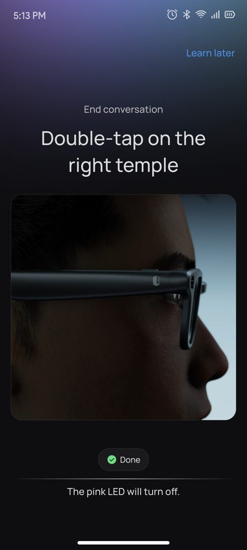
- Two paths. With "Hey Buddy" on: wake word → "Tell me a fun fact" → "Stop" → "What am I looking at?" → "Take a photo" → video. With it off: long tap on the temple to talk, double tap to end.
- Encouragement after each step: "That was simple!", "You are awesome!", "You are a quick learner".
- The screen moves on the first chunk of the AI's reply, not the full answer, so the conversation feels instant. If the AI is offline, the tutorial moves on after 5 seconds, with no error pop-ups.
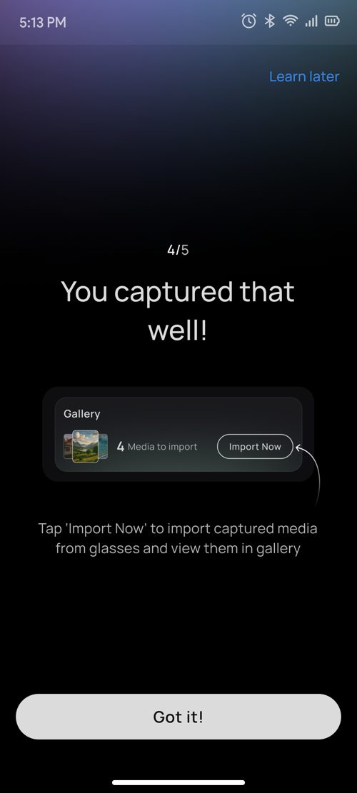
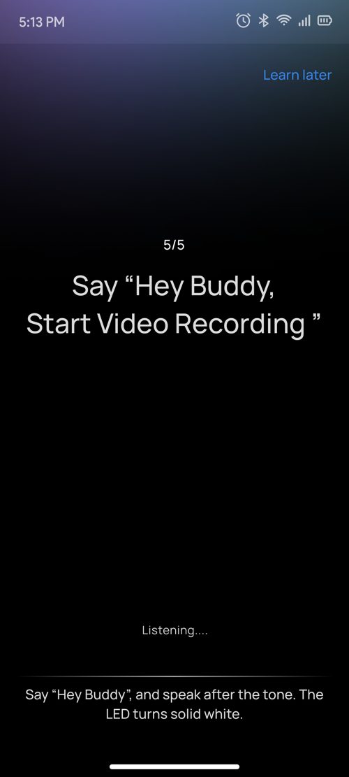
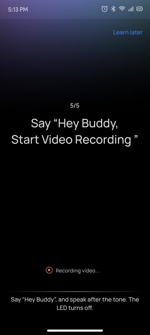
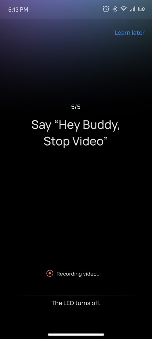
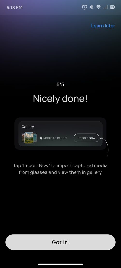


Milestone 5 · App connections
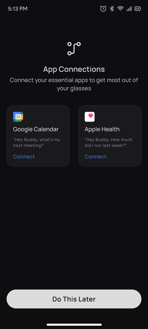
Google Calendar and Apple Health or Health Connect, with clear connected states and a "Do this later" option, then the user lands on the dashboard.
05The UX process — from problem to flow
The hardest part of this project was never the screens. It was the logic underneath: a device with no display, controls you can't discover on your own, and hardware that fails in everyday ways — a flat battery, Bluetooth off, a denied permission, another app grabbing the microphone. Onboarding had to absorb all of that and still make a first-time owner feel in control.
So we started with flows, not layouts. Each milestone was mapped as its own branching diagram: the happy path down the middle, and every pause, error and skip drawn as a branch off it. Before settling, we explored three structures.
- One long wizard. Simple to build, but rigid — a single failure like a flat battery or denied permission left the user stuck with nowhere to go.
- Free exploration. "Try anything you like." Too open for someone holding the product for the first time, with no sense of what to do or when they were done.
- Guided but recoverable — the model we shipped. One action per step, each step listening only for its own gesture, and every dead end turned into a guided fix instead of an error.
From there, three rules shaped every flow: map the failures first and give each one a recovery branch; keep one decision per screen so the UI stays simple; and make a skip always confirm, then resume, never dead-end. These are the final, build-ready flows handed to PM, engineering and QA. Tap a name to open the full diagram.
06Key decisions
The why behind each choice.
| Decision | Why |
|---|---|
| Gesture before voice | Hardware confidence first. Voice AI makes more sense once the user trusts the device. |
| Practise on the real device, not animations | People remember a gesture after doing it, not after watching it. |
| Personal details used by the AI | Makes Buddy feel personal from its very first sentence. |
| Privacy guide placed just in time | Shown at the first capture, so it's actually read. |
| Skip → confirm → recover | Respects the user's time without losing them for good. |
| Ask about the LED instead of assuming | Turns the most common pairing failure into a guided fix. |
| A wrong gesture is not an error | Keeps the tutorial encouraging, never punishing. |
07Edge cases & system thinking
Designing for hardware means designing for failure.
| Situation | What happens |
|---|---|
| App killed | Reopens on the same step with a "Reconnecting to glasses" message. |
| Phone call | AI audio pauses during the call; onboarding resumes after it ends. |
| Bluetooth off | A "Bluetooth required" overlay appears immediately. |
| Spotify playing | Pauses, and the tutorial audio takes over. |
| Siri / Google Assistant | Buddy keeps the microphone, so the system assistant doesn't trigger. |
| Onboarding abandoned | Skipped, closed or deleted: an "Onboarding OFF" signal goes to the glasses so they never stay stuck in tutorial mode. |
08Leadership
How I ran it.
- Broke the project into milestones and assigned them across the team.
- Built a single source of truth (user flow, iOS and Android pairing flows, screen states) for the PM, developers and QA.
- Set the copy-hierarchy rules for headings and sub-headings, reusing the system defined for Reminders.
What I taught the team. I mentored the junior designers to start from user behaviour and motivation, not screens. People open this app only because they've just bought the glasses, so onboarding must train them first. In a new category, training is the most important job onboarding has, and every design decision was tested against that.
09Impact
A usability test with 32 hired external users (not internal staff), run in June 2026, measured how people felt at the end of onboarding.
Where people still found it unclear
What we changed after the test. Pairing and the wake word were the two biggest friction points, matching the two hardest problems the flow set out to solve. So every tutorial step got a clear sub-text line at the bottom of the screen that tells the user exactly how the glasses and Buddy will react, for example "Say 'Hey Buddy' and speak after the tone. The LED blinks pink." and "The pink LED will turn off." Users no longer have to guess whether the glasses heard them.
10Learnings
- Onboarding is the manual. In wearables, onboarding is the manual, so it has to teach by doing.
- Design for failure. Hardware means designing for Bluetooth, battery, network and other apps going wrong.
- Confidence vs clarity. 96.9% felt confident, yet only 43.8% found nothing unclear. Practising on the real device carried people through the rough spots, but pairing and "Hey Buddy" still needed work.